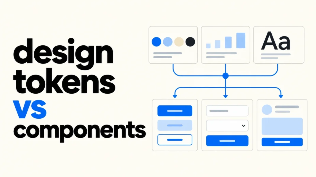

Design tokens vs components is a question of responsibility: tokens name reusable design values, while components turn design decisions into usable interface elements. A spacing token can describe a gap. A button component defines an action control, including its content, states, structure, and behavior. A small design system needs a clear connection between the two.
Start with a few real screens and trace one repeated element from its visual values to its interaction rules. This gives the team a working system to maintain, rather than a large library of names that no product actually uses.
Design tokens vs components: the practical difference
A token associates a meaningful name with a value and can carry information such as a type or description. Examples include a surface color, a spacing step, a text size, or a motion duration. A component packages a repeatable interface solution, such as a button, text field, or alert.
The Design Tokens Community Group’s 2025.10 Format Module defines token data and references for exchange between tools. It is a Community Group specification, not a W3C Standard. It does not define your component behavior or require every team to organize tokens into the same architectural tiers.
For a concrete component example, Carbon’s component overview describes reusable elements that solve interface problems. That is the useful dividing line: a color value supports the interface, while an alert component also needs content and rules for how people encounter it.
- Token question: which value should this property use, and what does that value mean?
- Component question: what does this element do, how is it structured, and which states must it support?
- Pattern question: how do several elements work together to complete a task?
Map one button before expanding the library
Imagine a small service with a “Save changes” action on three settings screens. Each screen currently uses a slightly different blue, padding, and corner radius. The team can first agree on one button component and map its shared properties to named values.
The following is an illustrative naming map, not an export from a particular design tool or a complete DTCG file:
- Palette value: blue-700 represents an agreed color value.
- Semantic role: color-action-background points to the color used for a primary action.
- Optional component role: button-primary-background points to that shared action role.
- Consumer: the primary button uses the selected role for its background property.
The alias relationship matters more than the particular spelling. The shared role can change its value for another theme while the button still asks for an action background. The component must separately pair that background with a suitable foreground and define hover, focus, pressed, disabled, and loading behavior where relevant.
Do not assume that all blue objects share the same purpose. A link, selected navigation item, and decorative illustration may look similar today but need to change independently tomorrow. Names based on intent make those decisions easier to discuss.
Keep token layers proportional to the system
A useful starting structure separates raw values from roles. Raw values describe the available palette or scale; role names explain how the interface uses them. Add component-specific tokens when a component needs a stable, independent styling decision that shared roles cannot express clearly.
Carbon’s color guidance provides a real example of roles that retain their names across themes while their values change. It also distinguishes shared color tokens from tokens dedicated to individual components. Treat that as an established system’s design choice, not a requirement to reproduce its full catalog.
A separate token for every property of every component can make a small system harder to navigate. Conversely, one global “brand color” used for every purpose can make a routine change affect unrelated elements. Add a layer to solve a documented need, and record which consumers depend on it.
A component owns more than its appearance
A set of approved colors does not make an accessible button. The component still needs an accessible name, appropriate semantics, keyboard operation, and a visible focus state. The WAI button pattern describes expected keyboard interaction and naming considerations. Prefer the native HTML button for ordinary web actions when it meets the need.
For the settings example, decide what happens during saving. Does the control prevent a second submission? How does the page communicate success or failure? Does focus remain understandable? These decisions belong in the component and task flow documentation rather than in a color token.
The same distinction applies to forms. A border token can style an input, but it cannot associate a label with that input or explain an error. Desinance’s accessible form design checklist covers those wider responsibilities.
Connect design tokens to components in code and design tools
Choose a documented source for shared decisions and an explicit route into each consumer. Record whether the team authors a value in a token repository, a design-tool library, or another agreed location. Then document how the next step receives it. Avoid two independently edited versions that both claim to be authoritative.
A practical handoff record for each shared role can include its name, intended use, type, theme values, owner, and component consumers. For each component, list supported variants and states, content constraints, and behavior. The record should let someone trace a change from the authored value to the rendered interface.
If the team exchanges DTCG data, verify the specific format version and features that each tool supports. A valid token file does not by itself prove that an importer preserves aliases or that an application loads the generated output. Inspect a small sample through the complete route before migrating the whole library.
Test combinations and states, not isolated swatches
Contrast depends on the colors used together. WCAG’s explanation of text contrast describes the relationship between text and its background. A token named “accessible-blue” cannot establish compliance wherever someone places it.
Build a small review page with the actual button, field, link, and alert in their supported states. Check each theme and relevant background combination. Include long labels, keyboard focus, zoom, and error content. Automated checks help, but someone still needs to inspect whether the flow remains understandable.
When a visual change fails, identify the responsible layer. An incorrect shared color may require a token correction. Missing focus behavior needs a component fix. Confusing recovery after a failed submission may need a flow or content change. This diagnosis prevents teams from creating extra tokens to compensate for unrelated problems.
Maintain the smallest useful system
- Audit a few live screens and choose elements that genuinely repeat.
- Define a compact set of values and meaningful shared roles.
- Map those roles to a small component set with documented states and behavior.
- Verify design-tool and code output against the same intended decisions.
- Review theme combinations, keyboard use, and real task flows before release.
- Track consumers before renaming or retiring a token or component.
If the starting point is unclear, a design audit can help reveal repeated inconsistencies before the team standardizes them. Work from observed product needs rather than inventing every possible future variant.
Design tokens vs components becomes easier to manage when each change has a clear home. Tokens carry reusable values and roles. Components carry interface structure and interaction. Connecting both to real screens gives a small team a system it can test, explain, and maintain.