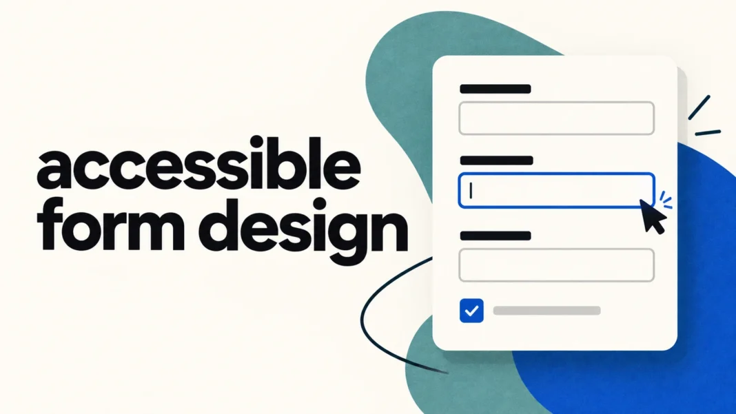

Accessible form design means people can understand, complete, and recover from a form using the input methods and assistive technology they rely on. Start with persistent labels, familiar controls, keyboard access, clear instructions, and errors that explain how to fix the problem. Then test the complete journey, including failed submissions and the success message.
A polished contact page can still fail at the moment someone tries to send a message. The placeholder disappears, a required field is unclear, or the submit button moves behind a sticky banner. This checklist focuses on those practical failures. Use it for contact forms, account registration, bookings, and checkout flows, while checking the requirements that apply to your particular service.
What accessible form design needs to cover
Accessibility involves the visible design and the implementation beneath it. A screenshot can show spacing and contrast. It cannot show whether a screen reader announces a field’s purpose or whether a keyboard user can reach a custom menu. W3C’s Forms Tutorial explains how structure, instructions, and feedback work together. Treat the following checklist as a focused review aid, rather than proof that an entire website conforms to WCAG 2.2.
For a wider review of navigation, branding, and interface consistency, pair this work with Desinance’s guide to design audits. Keep the form review tied to a specific user task: for example, sending a quote request without a mouse. That makes the result easier to reproduce and hand over to the team.
1. Keep labels visible and connect them to inputs
Give each field a clear name that remains visible after the user starts typing. A placeholder can illustrate a format, but it should not carry the entire explanation. For a work email field, use a persistent label such as “Work email” and put any additional guidance nearby.
The developer should connect the label to its control programmatically. With a native HTML label, the for attribute matches the input’s id. This relationship helps assistive technology identify the field and makes the label a useful clickable target. W3C’s labeling tutorial also explains when a visually hidden label can be appropriate. For ordinary forms, visible labels are the clearer starting point.
During review, click a text field’s label and check that the expected field receives focus. Then check what the screen reader announces. A visual label and an accessible name that describe different actions can leave users uncertain about which control they are operating.
2. Explain requirements before someone submits
State which fields are required and explain unfamiliar formatting rules before submission. Do not rely on a red asterisk alone. A brief instruction at the beginning can establish the convention, while individual fields provide specific guidance. Keep optional questions clearly marked.
Review every requested field against the task. A newsletter signup probably needs an email address. Adding a phone number and job title needs a separate reason. Fewer unnecessary questions also mean fewer instructions, validation rules, and error states for the team to maintain.
Group related choices so their shared question remains clear. For example, a group of contact-preference radio buttons needs the question “How should we contact you?” as well as individual option labels. Native fieldset and legend elements can express this relationship. See W3C’s grouping guidance for implementation details.
3. Make the entire task work with a keyboard
Test from the first field through submission without using a mouse. Tab forward, move backward with Shift+Tab, select options, open any supplementary controls, and correct a mistake. A custom dropdown that looks attractive but cannot be operated with the keyboard can block the whole task.
WCAG’s Keyboard criterion requires a keyboard way to operate functionality, with an exception for functions that inherently depend on a movement path. Ordinary form completion does not need that exception. Native inputs, selects, and buttons provide a useful foundation, though the complete implementation still needs testing.
Keep focus visible as users move between controls. Also inspect overlays, cookie notices, and sticky footers. Under WCAG 2.2’s Focus Not Obscured (Minimum) criterion, an element receiving keyboard focus must not be entirely hidden by content the author created. A practical design target is stronger: keep the active field and relevant instructions comfortably in view.
4. Check contrast and touch targets separately
Check field labels, help text, and errors against their actual backgrounds. WCAG’s Contrast (Minimum) criterion generally requires 4.5:1 for ordinary text and 3:1 for qualifying large text, with defined exceptions. Do not assume a pale gray hint passes because the main heading is readable. Input boundaries and focus indicators need their own review under the relevant non-text requirements.
On touchscreens, small controls create another problem. WCAG 2.2’s Target Size (Minimum) criterion sets a 24 by 24 CSS pixel minimum for pointer targets, with exceptions including sufficient spacing. This is not a blanket rule that every visible icon must be 24 pixels wide. Inspect the clickable area and the neighboring targets. Larger comfortable controls are often a sensible design choice.
5. Write errors that help people recover
An error should identify the affected field and explain the next useful action. Compare “Invalid input” with “Enter an email address in the format [email protected].” The second message gives someone a way forward. Pair text with any color or icon so users do not have to interpret the decoration alone.
When the system automatically detects an input error, WCAG’s Error Identification criterion calls for identifying the item and describing the error in text. Keep the message close enough to the field that the relationship is clear, and ensure the implementation exposes that relationship to assistive technology.
For a longer form, consider a summary that lists the errors and lets users jump to the relevant fields. Preserve valid entries where appropriate. W3C’s notification tutorial describes approaches for both overall and inline feedback. Choose an approach that announces the result without forcing someone to search the entire page for what changed.
A before-and-after review example
Imagine a quote-request form with an email field, a project description, and a “Send request” button. In the initial design, submitting an empty form turns both borders red and shows “Something went wrong.” The redesigned version keeps the labels visible, adds “Enter your email address” beside the email field, and adds “Tell us what you need help with” beside the description. A summary at the top links to both fields. This is an illustrative design example, not a reported usability test.
6. Reduce repeated entry and support familiar input
Use appropriate input types and autocomplete values for common personal information. WCAG’s Identify Input Purpose criterion addresses fields collecting information about the user when their purposes are covered by its defined list. Correct semantics can help browsers and assistive technology recognize what information belongs in a field.
In a multi-step flow, avoid making people retype information the process already has. WCAG 2.2’s Redundant Entry criterion generally requires previously supplied information needed again in the same process to be populated automatically or available for selection. It includes exceptions, such as security needs or information that is no longer valid. Review a “billing address is the same as shipping” choice against the actual flow rather than applying the rule mechanically.
7. Verify mobile layout and a clear completion state
Test the form at a narrow viewport and with enlarged text. Keep related labels, fields, and help messages together. Watch for horizontal scrolling caused by fixed-width inputs or error messages that push the submit button out of reach. A straightforward single-column layout is a useful starting point, but test the real content rather than assuming the layout will behave well.
After submission, explain what happened and what comes next. For a quote request, a message might say “Your request has been sent. We will reply to the email address you provided.” Only promise a response time if the team can honor it. If the request fails because of a network problem, explain whether it was saved and whether retrying could create a duplicate.
An accessible form design handoff checklist
Before handing the form over, record the page, the tested task, the browser and device, and the result. Include the failed-submission path as well as the successful one. A useful review record gives the next person enough information to reproduce the issue.
- Labels: each control has a persistent visible label or a justified alternative, with the correct accessible name.
- Instructions: required fields, formats, and grouped questions are understandable before submission.
- Keyboard: the full task is operable, focus is visible, and overlays do not hide the active control.
- Presentation: text contrast and pointer target sizes have been checked against the applicable criteria.
- Errors: messages identify the problem, offer useful correction guidance, and are connected to the affected fields.
- Recovery: valid entries survive appropriate error paths, and repeated information is handled deliberately.
- Completion: success and failure states are understandable, including with assistive technology.
Use automated checks to catch some implementation defects, then perform manual keyboard, screen-reader, and mobile checks. Record unresolved issues instead of marking the form “accessible” based on a clean tool report. Fix the failures that prevent task completion first, and retest the same journey after the change.