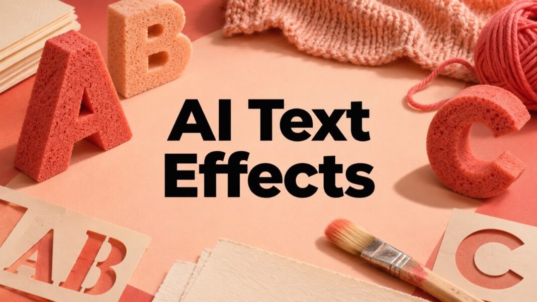

AI text effects can make a headline look knitted, metallic, painted or carved, but an interesting texture is useful only when the words remain readable. Adobe Express provides a generative text-effects workflow alongside ordinary text controls. The practical challenge is deciding which words deserve decoration and which information should stay plain.
This guide describes the official creation steps and a review method for posters, social graphics and small website cards. It uses a hypothetical craft-market graphic to explain the decisions. It does not claim that the examples were generated or tested inside Adobe Express, and it makes no promise that an effect will work equally well with every font or word.
What AI text effects are good for
A textured word can establish a visual theme quickly. Knitted lettering might suit a craft event; a brushed-metal treatment might suggest a workshop. Use the effect as a display element, with supporting details set in ordinary type. The date, venue and booking information should not depend on a reader deciphering an elaborate surface.
Keep the distinction between a text effect and font selection clear. A typeface provides the underlying letter shapes; a generated treatment changes their appearance. If the base lettering is too narrow or decorative, extra texture can make the result harder to read. Our open-source font guide provides a starting point for thinking about families and licensing, while the actual font’s terms remain the authority.
Prepare a simple lettering brief
Choose one short phrase
For a hypothetical weekend craft market, begin with a short display phrase such as “MAKE”. Keep the descriptive subtitle, date and location separate. A single large word gives you room to inspect letter shapes and texture without shrinking the entire message into a dense decorative block.
Write down the exact spelling and capitalisation before generation. If the final design uses a business name, verify that name against the approved brand material. Do not accept a visually appealing version that changes a letter or adds punctuation. Decorative treatment should not change what the audience is being asked to read.
Describe a material, then a treatment
Use a concise material description rather than a long list of competing effects. A proposed starting description is “soft cream knitted wool with a subtle woven texture”. A request combining chrome, wool, flames and glass makes it harder to judge whether the result follows a coherent direction.
Choose a background that supports the lettering. Cream texture on a pale background may need more separation than a dark coral surface. Consider the intended destination before spending time on variants. A large print poster and a small square card place different demands on the same word.
Create the effect in Adobe Express
Adobe’s web text-effects instructions describe opening Generative AI, selecting Generate text effects, entering a texture description, choosing available font, tint and style options, then generating and downloading a result. Review the controls actually shown in your account, since access and interface details can change.
Generate a small number of variants with a clear purpose. One might explore a stronger texture; another might use a simpler base font. Compare them against the original brief instead of choosing the most elaborate option automatically. If the texture dominates the letters, a quieter treatment may communicate the idea more effectively.
Keep ordinary copy in normal text boxes. Adobe’s text-editing documentation explains controls for content, font, size, colour and alignment. Use those controls to establish hierarchy before adding more visual treatment. A headline can be decorative while its supporting information remains consistent and easy to scan.
Review the actual letter shapes
Check counters, gaps and neighbouring letters
Inspect the enclosed space inside letters such as A, B, O and P. Texture can fill those spaces or create false edges. Look at the gaps between neighbouring letters too. An effect that joins two letters can change the perceived word even when the underlying text is spelled correctly.
Reduce the image to the expected viewing size and read it without referring to your brief. If you already know the word, you may unconsciously fill in missing details. Ask another person to read it briefly, without giving them the answer first. Their hesitation can reveal a shape problem that a full-size inspection missed.
Separate intentional texture from damage
A rough edge can be part of the intended material, but it should not resemble an accidental cut or a missing stroke. For the knitted example, inspect whether strands obscure the crossbar of the A or make the M look like separate marks. Keep the effect’s character while rejecting details that undermine recognition.
If the underlying font is unfamiliar, our font-identification guide explains how to compare letter forms and locate a suitable alternative. Identification and permission are separate checks: recognising a font does not itself grant rights to use it.
Design for the smallest card first
Place the short headline inside a generous central safe area. When a 16:9 image is centre-cropped to a square, much of the left and right sides disappears. Keep essential letters away from those edges, and leave clear space around the word. Test the crop in the site or platform that will display it rather than relying on the uncropped export.
At small sizes, fine texture can turn into visual noise. Increase the simplicity of the material treatment before making the headline fill every available pixel. A plain, strong title with a textured object beside it can sometimes communicate the same idea more clearly than text covered in intricate detail.
Make a separate version when the destination demands it. A poster may use a larger decorative word, while a website card uses a simpler treatment and fewer words. Keep the spelling and colour direction consistent across versions, but allow the composition to change for readability. Consistency does not require an identical crop everywhere.
Keep essential information available as text
If the graphic appears on a web page, provide the important message in nearby readable page text as well. Describe the image according to its purpose, and avoid making the image the only place where a date or instruction appears. A decorative title can support the page without carrying every piece of information alone.
For an accessibility reference, W3C’s guidance on images of text explains the preference for actual text when the same visual presentation can be achieved with it, alongside specific exceptions. Review the relevant requirements for your context rather than assuming that an attractive graphic is automatically an accessible communication.
Approve the export, not just the editor preview
Open the downloaded file and check spelling, dimensions, crop and edge quality. Test it against the background where it will appear. Make sure the supporting copy remains legible and the short headline still reads correctly after resizing. Keep the plain wording and editable design alongside the final image so future corrections do not require rebuilding everything.
Use AI text effects when the material treatment contributes to the message. Keep ordinary typography in charge of the information hierarchy. A successful graphic lets the audience recognise both the visual idea and the words quickly, including in the smallest desktop or mobile card where the design will be used.