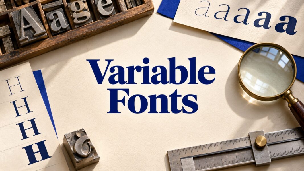

Variable fonts let a typeface provide a range of styles within one font file. For a designer, that can mean finer control over weight or width. For a web team, it creates a practical question: how do you turn those controls into readable, consistent typography without adding unnecessary downloads or fragile implementation choices?
This guide covers the workflow from choosing a font through browser checks and delivery. For choosing families and checking their licensing context, start with our open-source fonts guide. Here, the focus is applying variation deliberately, especially when a heading moves from a large desktop layout into a small mobile card.
What variable fonts actually vary
A variable font contains supported design axes rather than an unlimited ability to redraw any letter. Google Design’s introduction explains how these axes provide continuous choices within a typeface. Some fonts support weight, while others also provide width, optical size, or custom controls. Inspect the specific family instead of assuming every variable font offers the same options.
Weight changes how heavy the strokes appear. Width changes how broad or condensed the letterforms are within the font’s supported design. Optical size provides designs intended for different text sizes when the font includes that axis. These controls solve different problems. Increasing weight is not equivalent to increasing text size, and condensing a headline does not make an unlimited amount of text readable.
Begin with a small specimen containing your actual content: a heading, a paragraph, a button, a price, and a few difficult names. Include punctuation and the languages your product supports. A specimen made only from short English words can hide missing characters or awkward spacing that becomes obvious on a real page.
Choose a small set of useful styles
Continuous control does not require continuous improvisation. Define a few named roles such as body, caption, card title, and page heading. Assign a weight and size to each role, then test them together. This gives editors and developers a repeatable system rather than a collection of unrelated slider positions.
For a hypothetical editorial site, you might start with a regular body style, a moderately stronger card title, and a heavier page heading. Those are starting choices for evaluation, not universal recommended values. Inspect the particular font at the sizes your layout uses. A numerical weight of 500 does not guarantee the same visual effect across unrelated families.
Keep the first version restrained. If you introduce weight, width, optical size, and a custom axis simultaneously, it becomes difficult to identify why a component feels wrong. Add another control when it solves an observed problem. Document that reason so later changes do not silently undo the original decision.
Implement variable fonts with the appropriate CSS controls
MDN’s variable-font guide describes the relationship between registered axes and CSS properties. Declare the supported weight range in the font-face rule, then use the usual font-weight property where appropriate. The declared range should match the file you are actually serving. A filename containing variable is not enough evidence of its capabilities.
Prefer normal styling properties for ordinary weight and style choices. The lower-level font-variation-settings property is useful when you need direct axis control, including custom axes. Keep that use intentional. Spreading raw axis settings across many components makes a later typography change harder to reason about and can create conflicting rules.
Verify the rendered font in browser developer tools. Check that the expected file loaded and that the selected weight changes the actual face. A fallback font can make a page appear functional while concealing a loading problem. Inspect the network request and rendered font together before concluding that a variation setting has no effect.
Use optical sizing where the font supports it
Optical sizing can adapt a typeface’s design to its rendered size when the font supplies the relevant variation. MDN’s font-optical-sizing reference explains the auto and none settings. Enabling auto does not create an optical-size axis in a font that lacks one.
Compare a short paragraph and a heading with the relevant setting enabled and disabled. Look at character spacing, fine details, and the general reading texture. Keep the text size constant during that comparison. Otherwise, a size change can be mistaken for an improvement caused by optical sizing.
Use actual device screenshots as part of review, but also read the live page. A zoomed design-tool canvas does not reproduce browser rendering at normal scale. Keep a record of the font file version and settings used in the accepted design so the implementation can be checked against the same source.
Make small card titles readable
A card headline needs enough space, contrast, and useful wording before fine typographic adjustments can help. Start by testing the longest realistic title in the narrowest card. Allow sensible wrapping. Shorten an unnecessarily long visual headline when editorially appropriate, while preserving the full article title in the page content.
Do not solve every overflow by reducing the font size. First inspect padding, available width, line height, and the number of words. A slightly different supported width can be worth testing, but a heavily condensed title may become harder to scan. Compare the result with the original at normal viewing size rather than admiring it only on an enlarged artboard.
Check a range of content lengths, including a long unbroken name, numerals, and translated text. Our bento-grid design guide provides layout context for cards of different sizes. The typography should remain understandable across those sizes without requiring a separate improvised solution for every item.
Measure downloads instead of assuming a speed improvement
A single variable file can replace multiple static files in some setups, but that does not make every variable-font implementation smaller. Compare the actual files your page requests. A project using only one static weight has a different starting point from a project loading several weights and styles.
Measure with a clean browser session and a representative page. Record requested font files, transferred bytes, and what readers see before the font arrives. Check a slow connection as well as a warm repeat visit. An implementation that looks fast on your own cached desktop may still produce distracting changes for a first-time mobile reader.
Also review fallbacks. Compare line breaks and component height before and after loading. A card that shifts when its font changes can affect the surrounding page. Address the actual cause through font choice, fallback tuning, and loading decisions rather than treating the variable format itself as a performance guarantee.
Prepare a clear design-to-development handoff
Deliver the exact font files or their approved source, the licence information, and a small table of typography roles. For each role, record family, size, weight, line height, and any non-default variation settings. Include a specimen page showing long and short content at desktop and mobile widths.
Define acceptance checks in plain language: headings wrap without hiding words, body text remains readable at normal scale, required characters appear correctly, and the intended font loads. If a visual reference uses a font you cannot identify, our font identification workflow can help narrow the search before implementation begins.
Variable fonts work best when their flexibility supports a clear reading task. Select a family for the content, establish a few dependable roles, verify browser behaviour, and measure the resulting files. The goal is a typography system your team can reproduce across devices, with enough control to handle small cards without turning every headline into a new experiment.