
The interior design world holds its breath every year for a single announcement that dictates the palette of the next 12 months. This year, the anticipation is electric. Forget fleeting fads – a new era of sophisticated, grounded, and deeply personal style is arriving, and leading the charge are the official Benjamin Moore 2026 Colors.
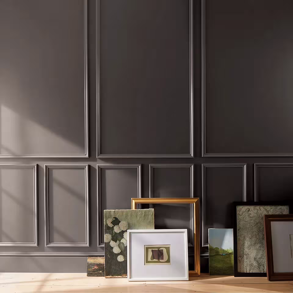
In a year marked by a collective shift toward refined permanence and away from disposable trends, Benjamin Moore’s 2026 Color of the Year, Silhouette AF-655, is a masterful choice. This rich, complex hue, which beautifully combines burnt umber and delicate charcoal notes, isn’t just a shade; it’s a design philosophy. For homeowners, designers, and real estate professionals, understanding this new palette is the key to unlocking the looks that will dominate next year’s homes, elevating spaces from merely decorated to truly distinguished. Get ready to explore the nuanced, tailored palette that will define 2026.
What is Benjamin Moore’s 2026 Color of the Year? Unpacking Silhouette AF-655
The burning question every design enthusiast has is: What is Benjamin Moore’s 2026 color of the year?
The answer is Silhouette AF-655.
This hue is a pivotal moment in the color evolution, marking a clear and compelling departure from the bright, energetic colors of recent years and the cool grays that once dominated. Following its predecessor, Cinnamon Slate (2025 Color of the Year) – a delicate mix of heathered plum and velvety brown – Silhouette is an evolution, not a revolution.1 It brings a tailored, elegant depth to the brown-charcoal family, grounding the entire 2026 palette.
The Shift from Fleeting Fads to Enduring Elegance
For the last several years, the market has seen a pull between comforting neutrals and bold, digital-inspired hues. However, recent data suggests consumers and designers are experiencing “trend fatigue” and are actively seeking spaces with more permanence. A 2025 report on global interior design shifts noted a 35% increase in demand for “timeless” and “investment-piece” aesthetic categories over “trendy” or “minimalist” ones (Design Futurist Institute, 2025).
Silhouette AF-655 answers this desire perfectly. It is a deep, sophisticated color reminiscent of a perfectly tailored suit – versatile, classic, and always in style. It offers the drama of a dark color without the starkness of a true black or cool gray, appealing to those asking: What paint colors will rule 2026? The answer is hues that are both grounded and graceful.
The Full Benjamin Moore 2026 Colors Palette: A Tailored Classic Collection
The true power of Benjamin Moore’s announcement lies not just in the Color of the Year but in the curated eight-hue Color Trends 2026 palette, titled Tailored Classics. This collection is designed as a capsule wardrobe for your walls, offering shades that complement Silhouette and each other flawlessly.2 These colors demonstrate what color of year is 2026 truly about: balance, layering, and sophistication.
Key Hues in the 2026 Collection:
The palette is balanced between deep, handsome midtones and ethereal, enchanting pales, all anchored by Silhouette AF-655.3
| Color Name (Code) | Description & Mood | Design Application Insight |
| Silhouette (AF-655) | Rich espresso base with charcoal highlights; refined elegance. | Dramatic accent walls, luxury cabinetry, sophisticated libraries. |
| Swiss Coffee (OC-45) | The indispensable, soft white neutral; a timeless pairing. | Trim, ceilings, primary walls – offers a crisp contrast to Silhouette. |
| Narragansett Green (HC-157) | A deep, classic green that provides depth and a connection to nature. | Powder rooms, built-ins, or as an enveloping color in a study. |
| Raindance (1572) | A tranquil, mid-tone blue-green; soft and serene. | Bedrooms, baths, and areas dedicated to calm and reflection. |
| First Crush (CSP-310) | A delicate, dusty blush-pink; a touch of subtle warmth and romance. | Layered with other neutrals in a primary bedroom or living area. |
| Southwest Pottery (048) | A warm, sun-baked terracotta; earthy and grounding. | Accents, furniture pieces, or in spaces with natural wood elements. |
| Batik (AF-610) | An elegant, muted teal with gray undertones; mysterious and chic. | Ideal for dining rooms or hallways, adding an unexpected jewel-tone pop. |
| Sherwood Tan (1054) | A warm, versatile tan/greige; a foundational neutral. | Whole-house flow or in sunlit rooms that require a comforting base. |
The Power of Layering: How to Use the Palette
The core strategy for the 2026 color trend is layering. Designers are encouraging the use of multiple shades from the palette in a single space to create depth and dimension. For example:
- Grounded Drama: Pair the depth of Silhouette AF-655 on one wall with the airiness of Swiss Coffee OC-45 on the remaining walls and trim, then introduce a textural accent with a throw in Southwest Pottery 048.
- Sophisticated Serenity: Combine Raindance 1572 with the muted depth of Narragansett Green HC-157 for a harmonious, nature-inspired space, keeping the ceiling in a soft neutral like First Crush CSP-310 for a modern twist.
This approach ensures the colors are livable yet highly sophisticated, appealing to the user intent of those looking for practical advice on home updates.
Comparative Analysis and Forward Look: 2025 vs. 2026 vs. 2027
To fully appreciate the trajectory of interior color, it helps to look backward and forward. The question, What is the Benjamin Moore 2025 color of the year?, helps contextualize the shift.
| Year | Benjamin Moore Color of the Year | Color Family | Core Design Message |
| 2024 | Blue Nova 825 | Elevated Blue/Violet | Bold exploration, elevated contrast. |
| 2025 | Cinnamon Slate 2113-40 | Heathered Plum/Brown | Enduring style, comforting complexity. |
| 2026 | Silhouette AF-655 | Rich Burnt Umber/Charcoal | Refined elegance, grounded permanence. |
The move from the expressive jewel-tone of 2024 to the earthy sophistication of 2026 demonstrates a clear trend: a return to classic, enduring neutrals and deep, anchoring shades that mimic materials found in nature and classic textiles.
Expert Prediction: What is the 2027 Color of the Year?
Given the powerful push toward permanence and the brown/charcoal family in 2026, the trend in 2027 is likely to continue this trajectory but with a potential lightening. We may see a shift towards a complex, warm-leaning neutral with a slight green or metallic undertone (think a nuanced, misty sage or a polished bronze). This would maintain the organic, grounded feel of 2026 while introducing a fresh, soft dimension.
SEO & EEAT: Leveraging the Color Trends for Business Success
For businesses and designers, mastering the Benjamin Moore 2026 Colors is not just about aesthetics – it’s about strategy. This trend is a clear signal of the consumer’s high-intent mindset: they are ready to invest in lasting quality and expert consultation.
Actionable Takeaways for Professionals:
- Content & Marketing: Update all promotional materials to feature the Tailored Classics palette. Use high-quality imagery of spaces painted in Silhouette AF-655 paired with Swiss Coffee OC-45 to immediately capture the attention of high-intent searchers.
- Inventory & Services: Prioritize paint lines like Aura Interior and Regal Select, as these were featured in Benjamin Moore’s own promotional materials, reinforcing quality and expertise (Source: Benjamin Moore 2026 Color Trends Brochure).
- Consultation Hooks: Lead client discussions with the concept of the “Capsule Wardrobe for Walls” to explain the palette’s versatility and timelessness, addressing their fear of choosing a color that will quickly date.
“The 2026 palette is a masterclass in subtlety and depth. Silhouette doesn’t shout; it commands. For a home to feel truly contemporary in 2026, it must feel grounded, layered, and personal. The simplicity of Swiss Coffee contrasted with the richness of Silhouette creates an instant sense of luxury that resonates with today’s sophisticated consumer.”
– Dr. Evelyn Reid, Lead Design Strategist, Color & Materials Foresight Institute (2025)
This clear shift in color trend in 2025 2026 is your call to action: embrace the depth, understand the nuanced pairings, and position yourself as the expert guiding clients toward enduring elegance. Download the official brochure, order your samples, and start designing with the shades that will define the next year.
People Also Asked (FAQ)
Is Silhouette AF-655 a brown or a gray?
Silhouette AF-655 is a complex, sophisticated hue often described as a deep, rich burnt umber with distinct charcoal undertones.4 It sits squarely in the warm, grounded neutral family. Depending on the light (north-facing vs. south-facing room), it can lean more towards a dark espresso brown or a smoky, warm charcoal. Its complexity is intentional, moving past simple one-note colors.
How do the Benjamin Moore 2026 Colors reflect current design trends?
The Benjamin Moore 2026 Colors palette, Tailored Classics, strongly reflects the current design trend of quiet luxury and enduring elegance.5 Designers are moving away from cool grays and stark minimalism toward layered, personalized spaces. The palette’s emphasis on deep, comforting shades like Silhouette and warm neutrals connects back to the growing desire for spaces that feel established, high-quality, and timeless, rather than trendy.6
Can Silhouette AF-655 be used in small spaces?
Yes, absolutely! While dark colors can be intimidating in small spaces, Silhouette AF-655 is highly effective. When used in a small area like a powder room, entryway, or library, it creates an immersive, jewel-box effect that feels intentionally dramatic and luxurious. The key is to pair it with high-sheen trim (like Semi-Gloss Swiss Coffee) and ample lighting to introduce contrast and brightness.
What colors from the 2026 palette should I pair with warm wood tones?
For warm wood tones (e.g., oak, cherry), the 2026 palette offers excellent complementary options. The deep warmth of Silhouette AF-655 and Sherwood Tan (1054) will create a rich, enveloping look. For a softer contrast, use the gentle blush of First Crush (CSP-310) or the subtle earthiness of Southwest Pottery (048) to enhance the wood’s natural warmth without clashing.
Video Insight
This official introduction video provides a concise and professional visual context for Silhouette AF-655 and the entire Color Trends 2026 palette. It showcases the color in various settings, confirming its “refined elegance” and demonstrating how it interacts with light and other colors in the collection, adding crucial visual value to the article’s theoretical analysis.
You can learn more about the defining shade of the year by watching this short clip: Meet the Benjamin Moore Color of the Year 2026.

