Why the YouTube Logo Is One of the Most Powerful Digital Symbols Ever Created
The YouTube logo is one of the most instantly recognizable visual identities in the digital world. Whether you’re watching a short video on your phone, streaming content on a smart TV, or embedding videos on a website, the red play button immediately signals video, entertainment, and global culture.
Understanding the YouTube Logo History is not just a lesson in graphic design – it’s a masterclass in branding evolution, product strategy, and digital transformation. Since its launch in 2005, YouTube’s logo has changed multiple times, reflecting shifts in technology, user behavior, and the platform’s role in society.
From a simple text-based logo inspired by television screens to a minimalist icon recognized across every continent, YouTube’s visual journey mirrors the story of the modern internet itself.
The Early Days of YouTube and the First Logo (2005–2011)
The Birth of YouTube in 2005
YouTube was founded in February 2005 by Chad Hurley, Steve Chen, and Jawed Karim, three former PayPal employees who identified a growing need for easy online video sharing. At the time, uploading and watching videos online was complicated, slow, and fragmented.
The platform launched publicly later that year, and with it came the first YouTube logo – a visual identity designed to communicate one simple idea: online video for everyone.
What Is the Oldest Logo of YouTube?
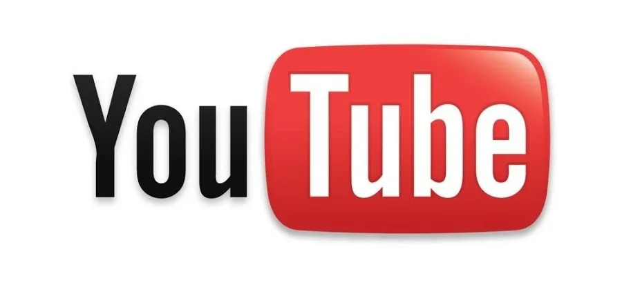
The oldest YouTube logo (2005–2011) consisted of:
- The word “You” in black
- The word “Tube” in white
- A red rounded rectangle behind “Tube,” resembling a TV screen
This design wasn’t accidental.
Meaning Behind the Original Design
- “Tube” was slang for television (cathode-ray tube TVs)
- The red shape symbolized a video container
- The contrast between black, white, and red made it highly legible
At a time when most websites relied heavily on skeuomorphic design, gradients, and glossy effects, YouTube’s logo was bold, simple, and functional.
Why the Original YouTube Logo Worked So Well
The early YouTube logo succeeded because:
- It explained the product instantly
- It felt familiar to users raised on television
- It stood out among cluttered early-web designs
- It scaled well across browsers and early mobile devices
This logo became iconic in its own right, appearing during YouTube’s first viral boom and the birth of internet creators.
The Google Acquisition and the First Design Shift (2006–2011)
How Much Did Chad Hurley Sell YouTube For?
In October 2006, just 18 months after launch, Google acquired YouTube for $1.65 billion in stock.
This acquisition marked a turning point not only for YouTube’s business model but also for its brand maturity.
Under Google’s ownership, YouTube:
- Scaled globally
- Introduced ads and monetization
- Became infrastructure, not just a website
The logo remained largely unchanged during this phase, a sign of brand stability and recognition, but subtle refinements began appearing.
Minor Refinements Without Breaking Recognition
Between 2006 and 2011:
- Gradients were softened
- Shadows were reduced
- The red tone became slightly deeper
These changes aligned with Google’s broader move toward cleaner interfaces while preserving YouTube’s core identity.
YouTube Logo Redesigns and the Shift to Modern Branding (2011–2017)
2011–2013: Flattening the Design
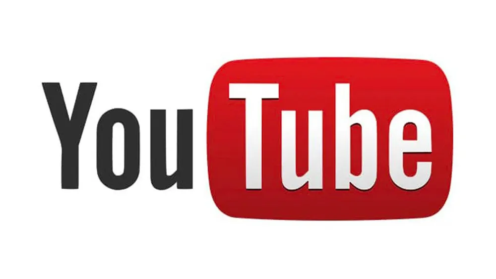
As smartphones and tablets became dominant, YouTube adapted its logo to:
- Smaller screens
- Touch-first interfaces
- Faster loading requirements
The logo became flatter, losing shine and bevels. This was part of a global design trend led by Google, Apple, and Microsoft.
Key improvements:
- Better readability on mobile
- Reduced visual noise
- Cleaner integration with app icons
2013–2015: Refinement, Not Reinvention
During this period, YouTube focused on:
- Consistent red across platforms
- Improved typography
- Stronger contrast
The logo still looked familiar, but it felt more digital-native rather than television-inspired.
This era coincided with:
- Explosive creator growth
- The rise of YouTubers as celebrities
- Expansion into music, gaming, and education
2015–2017: Preparing for a Bold Change
By 2015, the original “Tube”-inside-a-box concept was becoming outdated.
Users no longer associated video with TV screens, video had become platform-agnostic.
This realization led to YouTube’s most dramatic redesign.
The 2017 Redesign: Birth of the Play Button Era
Why YouTube Changed Its Logo in 2017
In 2017, YouTube introduced a completely restructured logo:
- The play button became a standalone icon
- The wordmark moved to the right
- The red rectangle no longer contained text
This was a strategic branding decision.
The Meaning Behind the Play Button
The play button:
- Is universally understood across languages
- Represents action and engagement
- Works perfectly as an app icon
- Requires no text for recognition
This change allowed YouTube to:
- Compete visually with Instagram, Facebook, and TikTok
- Strengthen brand recognition on mobile
- Create a modular brand system
Why the 2017 Logo Was a Branding Masterstroke
The new logo:
- Reduced dependence on typography
- Increased adaptability across formats
- Strengthened emotional recognition
This redesign marked YouTube’s transition from a website to a media ecosystem.
Modern YouTube Logo Updates (2018–2025)
Subtle Changes, Strong Consistency
Since 2017, YouTube has avoided drastic redesigns. Instead, it has focused on:
- Adjusting red tones for accessibility
- Improving contrast for dark mode
- Enhancing animation behavior
These updates ensure the logo remains:
- Accessible
- Future-proof
- Consistent across AR, VR, and TV platforms
2024–2025: Color Psychology and Accessibility
Recent refinements reflect:
- Better visibility for color-blind users
- Reduced eye strain
- Higher contrast on OLED screens
This demonstrates YouTube’s maturity as a global brand serving billions of users daily.
People Also Ask: YouTube Logo History FAQs
What is the story behind the YouTube logo?
The YouTube logo evolved from a television-inspired wordmark to a universal play-button icon, reflecting the platform’s shift from web video hosting to a global media powerhouse.
Is there a 20-year-old YouTube video?
Yes. The first YouTube video, “Me at the zoo,” uploaded on April 23, 2005, is over 20 years old and still publicly available.
Why did YouTube remove “Tube” from the logo box?
Because video consumption moved beyond television metaphors. The play button communicates video more effectively across cultures and devices.
Has YouTube ever changed its core brand color?
No. While shades of red have evolved, YouTube has consistently maintained red as its primary brand color for recognition and emotional impact.
What Brands, Designers, and Marketers Can Learn from YouTube Logo History
Key Branding Lessons
YouTube teaches us that:
- Evolution beats reinvention
- Simplicity scales globally
- Icons outperform text in mobile-first environments
- Brand consistency builds trust
“The strongest logos don’t shout – they adapt.”
If you’re building a brand today, YouTube’s logo evolution is proof that strategic restraint, user empathy, and long-term thinking outperform trend-driven design.
